During World War 2, Abraham Wald was asked to examine damage done to aircraft returning to base and recommend what areas to reinforce with more armor. What are the most important areas to reinforce?
It is a type of selection bias that can occur in biomedical research if participants with a particular exposure or characteristics are less likely to enroll in a study Glesby and Hoover, 1996.
Monty hall problem
Named after the Monty Hall host of a TV show where a similar game happened.
The result is strongly counter-intuitive.
Monty Hall Problem
‘Suppose you’re on a game show, and you’re given the choice of three doors: Behind one door is a car; behind the others, goats. You pick a door, say No. 1, and the host, who knows what’s behind the doors, opens another door, say No. 3, which has a goat. He then says to you, “Do you want to pick door No. 2?” Is it to your advantage to switch your choice?’
These are the estimates of accuracy for the dogs identifying nCov presence
Positive Test
Negative Test
nCov Absent
4%
96%
nCov Present
83%
17%
Let’s say a dog barks at an airport visitor. Bayesian statistics tries to understand the probability that the person is actually nCov positive using Bayes theorem [ ( | + ) = ]
The person testing positive for COVID is the data point. The person having COVID for real is the parameter.
The probability someone comes into the airport with nCov is unknown.
We can specify this probability from prior data.
The number of current cases is 9,165,744 Worldometer.
Thus we can approximate \P(\text{nCov}) = 9,165,744/333,000,000 = 0.0275.
We can then compute the probability that someone is sick, given that the the dog barked [ ( | + ) = ]
There’s less than 50% chance the person actually has nCov given the test is positive.
This is because the false positive rate is high enough and the COVID is rare enough that the majority of people who test positive are false positives.
Obviously, a decision still needs to be made about what to do with the person.
Fundamental difference in interpretation:
Parameter is “random.”
Probability represents our belief about the unknown value.
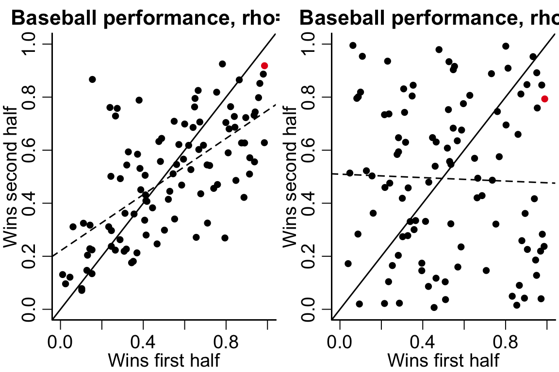
Regression to the mean
Regression to the mean comes up a lot in sports TDS:
The LA Dodgers, Los Angeles’ resident baseball team, appeared on the cover of Sports Illustrated August 28, 2017 issue following a run of tremendous form. They had won 71% of their games and were on pace to tie the record for the most wins in a season. The cover came with the caption “Best. Team. Ever?”
The team then went on to lose 17 of their next 22 games, and would eventually lose in the World Series to the Houston Astros. This is just one example of the notorious Sports Illustrated cover jinx, an urban legend that apparently causes teams and athletes who appear on the cover to immediately experience a run of bad form.
The phenomenon is due to a combination of selection bias and the amount of randomness inherent in the measurements.
100 people flipping coins example (completely random).
100 people heights example (not very random).
In the baseball example, there are unpredictable factors affecting the teams performance and the team was selected on Sport’s Illustrated’s cover because of their unusually successful performance.
Code
par(mfrow=c(1,2))set.seed(123)firstHalf =rnorm(100)secondHalf = (rnorm(100) + firstHalf)/2firstHalf =pnorm(firstHalf)secondHalf =pnorm(secondHalf)colinds =rep(1, 100)colinds[which.max(firstHalf)] =2plot(firstHalf, secondHalf, main ='Baseball performance, rho=1/2', ylab='Wins second half', xlab='Wins first half', ylim=c(0,1), xlim=c(0,1), col=cols[colinds])abline(lm(secondHalf~ firstHalf), lty=2)abline(a=0, b=1)firstHalf =rnorm(100)secondHalf =rnorm(100)firstHalf =pnorm(firstHalf)secondHalf =pnorm(secondHalf)colinds =rep(1, 100)colinds[which.max(firstHalf)] =2plot(firstHalf, secondHalf, main ='Baseball performance, rho=0', ylab='Wins second half', xlab='Wins first half', ylim=c(0,1), xlim=c(0,1), col=cols[colinds])abline(lm(secondHalf~ firstHalf), lty=2)abline(a=0, b=1)
Statistics in medical research (Biostatistics)
Features of Biostatistics medical research
Improving health and understanding biological mechanisms
Prediction/diagnosis clinical translation (sometimes with machine learning)
Collaboration on team with MDs, biologists, psychologists, epidemiologists, informaticians, etc.
Developing new statistical tools to address challenges in medical research!
Biostatisticians’ role on the research team
It is easy to fit statistical or machine learning models to data and get results.
It is difficult to understand how study design or analysis procedures may bias the results.
Organizing study results in a sensible structure.
Biostatistics offers tools necessary to reason through and understand the analysis procedures.
Example: Circularity analysis (SKIPPED THIS SECTION 2024)
Circularity analysis is a bad practice where the same data are used for variable selection and for prediction.
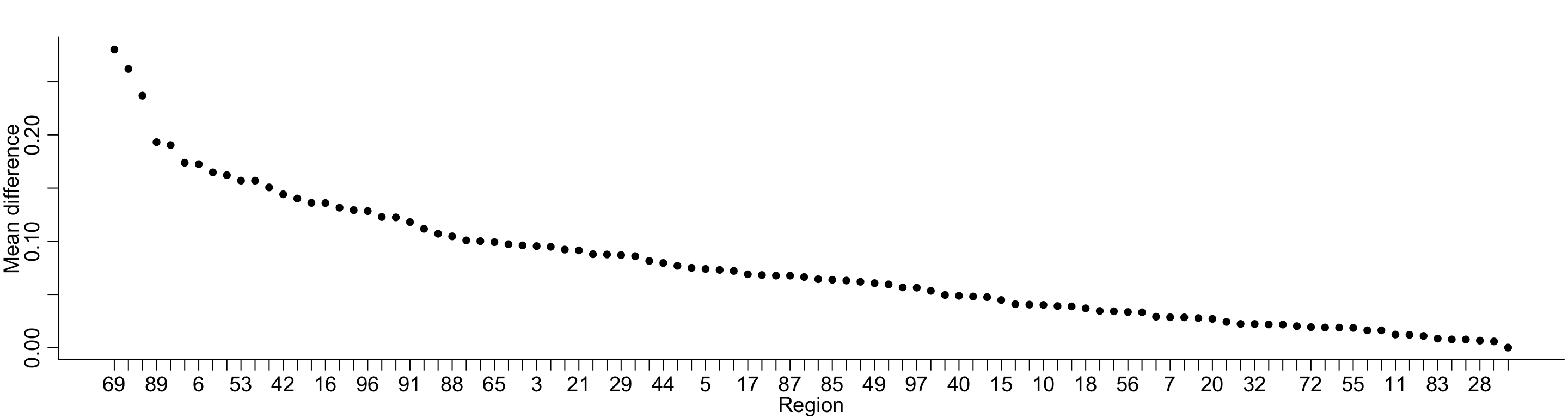
Let’s say I have measurements of brain activity across 100 brain regions and I want to know, which are associated with diagnosis (e.g. bipolar disorder) and to predict diagnosis using the brain imaging data
First, I fit a bunch of models to select important features
After selecting the features, we can fit a random forest to predict the outcome with our 5 strongest features.
Code
library(randomForest)
randomForest 4.7-1.1
Type rfNews() to see new features/changes/bug fixes.
Code
x =as.matrix(brain[,order(difference, decreasing =TRUE)[1:5]])rf =randomForest(x, y=diagnosis, ntree =1000)rf
Call:
 randomForest(x = x, y = diagnosis, ntree = 1000)
               Type of random forest: classification
                     Number of trees: 1000
No. of variables tried at each split: 2

        OOB estimate of  error rate: 38%
Confusion matrix:
        bipolar control class.error
bipolar      16       9        0.36
control      10      15        0.40
Code
knitr::kable(rf$confusion)
bipolar
control
class.error
bipolar
16
9
0.36
control
10
15
0.40
Code
#summary(glm(diagnosis ~ x, family=binomial))
The out-of-sample prediction error is 38%, indicating (100-38)% = 62% accuracy in predicting bipolar disorder from the brain imaging data.
While this accuracy isn’t great, the true accuracy should be 50% (random chance) – all of the data I showed were fake and there was not association.
Circularity analysis is a common mistake in high-dimensional biomedical data.
Biostatistical concepts help us to describe this error mathematically and understand how use methods to avoid it.
Learning about data (estimating values/statistics)
Descriptive statistics and their uses
Descriptive statistics are used to get an idea of what a dataset looks like
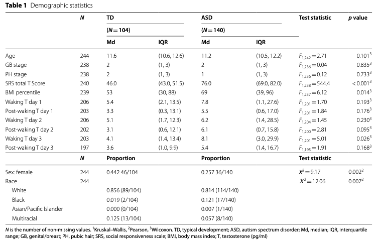
In research studies, they are frequently reported in a “Table 1”.
Standard deviation (SD) s = \sqrt{s^2} (square root of the variance)
Median is the middle value (or the average of the two middle values if n is even. the 50% ordered value.
Quartiles, the 25% ordered value and 75% ordered value. Some times call Inter quartile range (IQR).
These summary values provide information about what the distribution of data look like.
Code
nsduh =readRDS('nsduh/puf.rds')# age is categorical in this datasetagetab =table(nsduh$age)# proportions in each age groupagetab = agetab/sum(agetab)# quantile(nsduh$age, probs = c(0.5, 0.25, 0.75))agetab
# Number of cigarettes in the last 30 days# mean and standard deviationcigarettes =c(mean=mean(nsduh$ircigfm), SD=sd(nsduh$ircigfm))# quantilesqsCig =quantile(nsduh$ircigfm, probs =c(0.5, 0.25, 0.75))names(qsCig)[1] ='Median'qsCig
Median    25%    75%
     0      0      0
Code
library(table1)
Attaching package: 'table1'
The following objects are masked from 'package:base':

    units, units<-
Code
nsduh$ERvisit =factor(nsduh$ERvisit, labels =c('no', 'yes'))label(nsduh$ERvisit) ='Visited ER'label(nsduh$age) ='Age'label(nsduh$ircigfm) ='No. Cig last 30 days'table1(~ ERvisit + age + ircigfm, data=nsduh)
Overall (N=56897)
Visited ER
no
39818 (70.0%)
yes
15403 (27.1%)
Missing
1676 (2.9%)
Age
12-17
14272 (25.1%)
18-25
13660 (24.0%)
26-34
8751 (15.4%)
35-49
11361 (20.0%)
50 or older
8853 (15.6%)
No. Cig last 30 days
Mean (SD)
3.89 (9.53)
Median [Min, Max]
0 [0, 30.0]
Sometimes test statistics and p-values are reported as well, that compare values between two or more groups.
Basic univariate visualizations
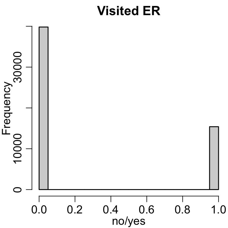
Histograms
A histogram creates evenly sized bins of the x-axis and plots the number of observations falling into that bin.
y_k(l_k, u_k) = \sum_{i=1}^n \mathrm{I}(x_i \in [l_k, u_k]),
where l_k, u_k are the lower and upper boundaries of bin k, respectively.
It is a nice way to summarize continuous variables.
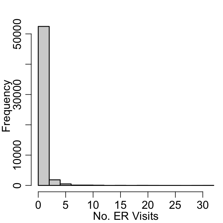
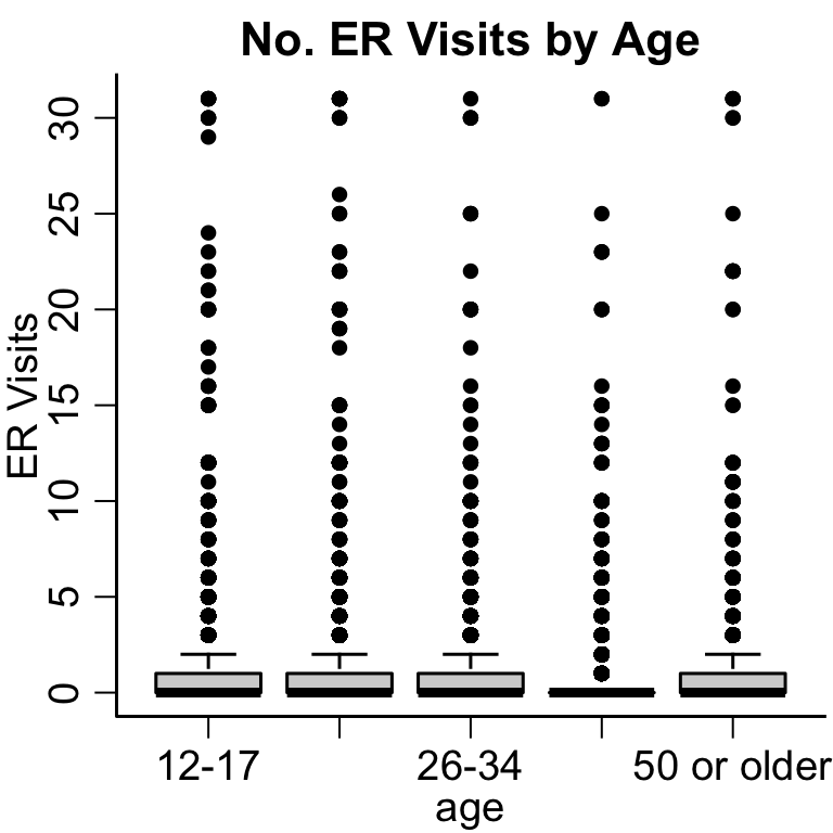
# Can change the number of binshist(nsduh$nERvisit, xlab ='No. ER Visits', main='')
Code
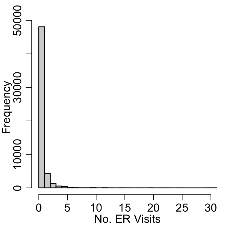
hist(nsduh$nERvisit, xlab ='No. ER Visits', main='', breaks =30)
Code
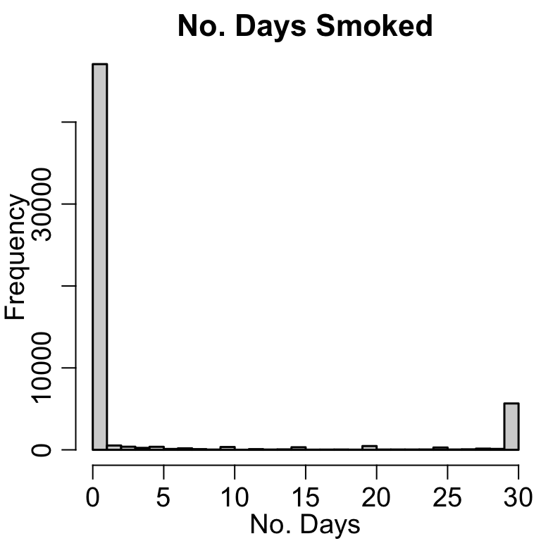
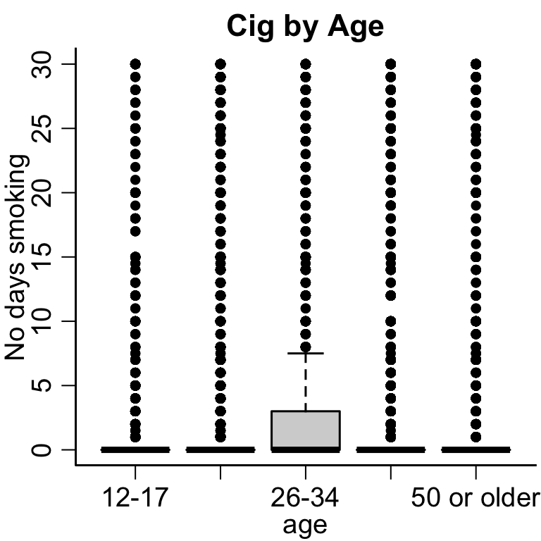
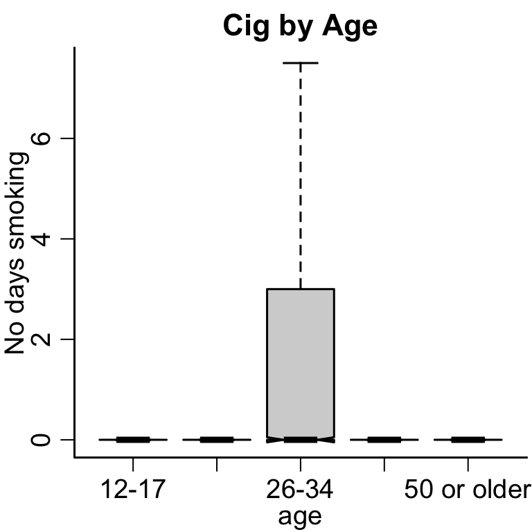
hist(nsduh$ircigfm, xlab='No. Days', main='No. Days Smoked', breaks=30)
This is an example of bi-modal data, where there are two different groups of people.
Density plots
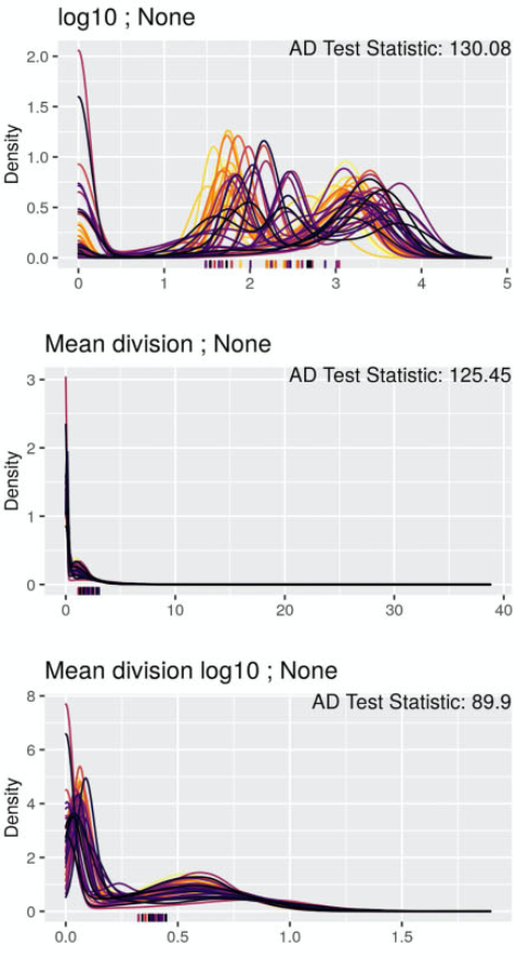
Density plots are good alternative visualization for continuous variables
This example from Harris et al. 2022 is comparing distributions of single-cell expression data from multiplexed immunofluorescence imaging data.
Example of density plots
QQ-plots
Basic bivariate visualizations
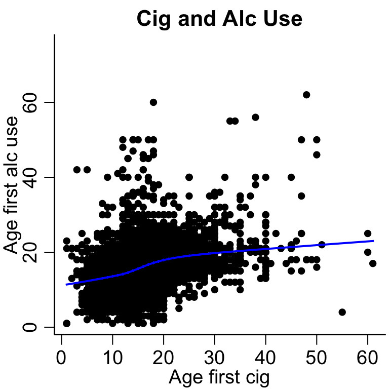
Scatter plot
With and without lowess smooth
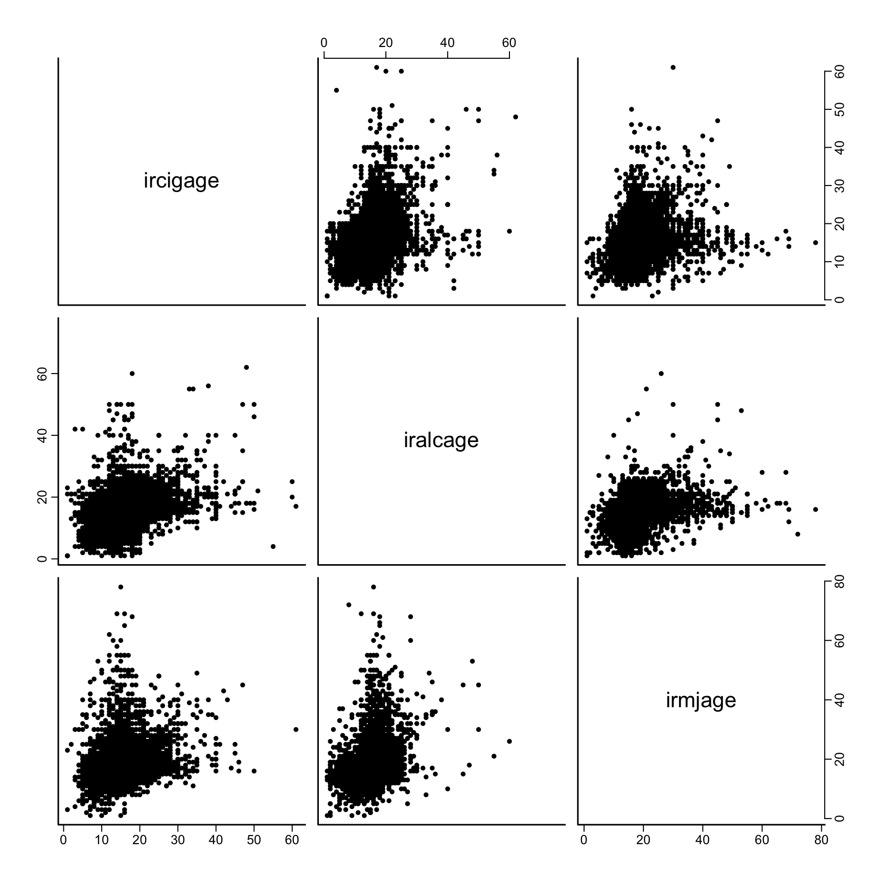
Scatter plot matrix
Code
# plot the data plot(nsduh$ircigage, nsduh$iralcage, ylab='Age first alc use', xlab='Age first cig', main='Cig and Alc Use')# remove missing values for lowess fitsubset =na.omit(nsduh[, c('ircigage', 'iralcage')])lines(lowess( subset$ircigage, subset$iralcage), col='blue', lwd=2)
 Image credit: